Fintech App landing page
Mobile app • UX + UI • Product design
Tools: Figma, Slack, Jira, Confluence, Zapier, Notion, ChatGPT
Client
SternPay Inc.
My Role
UX Researcher & UI Designer
Duration
4 Months
Project Focus
Mobile app, UX + UI, Product design
The Challenge
I built a landing page to showcase the best features of the mobile fintech app on currency exchange. The landing page also explains how the service works, what it offers, and includes a registration form to test a beta version. The goal is to collect relevant user data and feedback for continuous improvement.
Approach & Solution
A minimalist and intuitive mobile application that offers guided meditations, focus timers, and personalized insights into digital usage patterns. The design prioritizes a calming user experience.
Key Project Steps
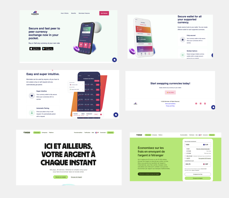
Competitive analysis
I checked all the direct and indirect competitors in the fintech sector to identify the best practices and avoid the same mistakes. Collect Reviews Filtering and Classification Comment Analysis Incorporating Insights
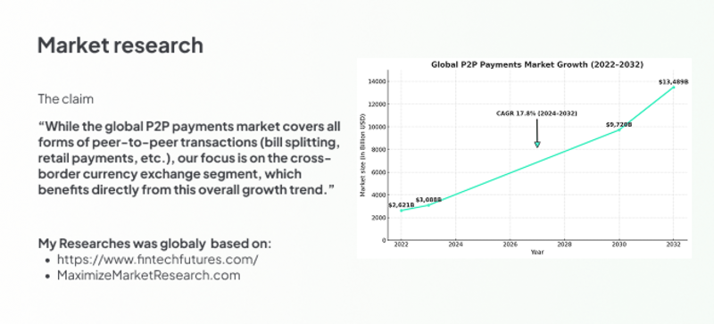
Market Research
The global FinTech market is experiencing exponential growth, with projections showing a massive increase in market size. This highlights the significant opportunity and user demand for innovative financial solutions.

Color palette
I used a color palette for this UX/UI project to ensure visual consistency throughout the interface. The palette was carefully selected to reflect the brand's identity while enhancing user accessibility. Each color was chosen to establish a clear hierarchy of elements, improve readability, and evoke positive emotions aligned with the user experience we aim to create.
Prototypes
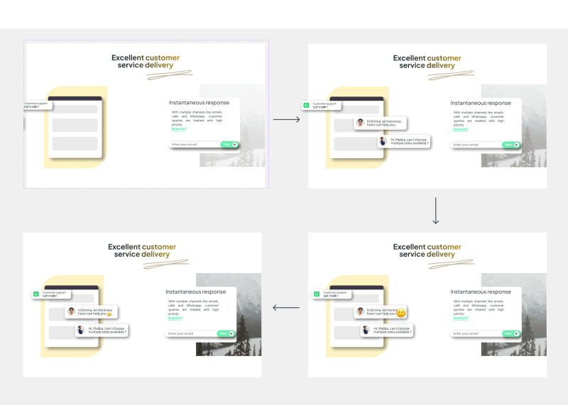
I created prototypes to help developers understand the animations to be implemented and visualize transitions clearly. These prototypes are also used to present the intended experience to stakeholders for validation and alignment. This approach ensures consistent implementation and effective communication.
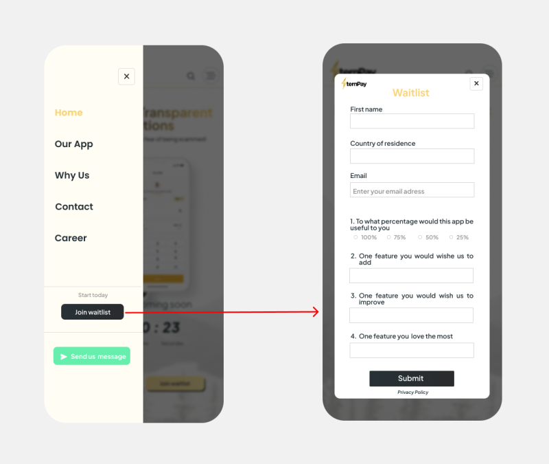
Join the Waitlist
Be the first to try the app and follow its evolution. Joining the waitlist lets us notify you by email about: – New beta updates – Testing opportunities – Official launch announcements It’s the best way to stay in the loop — and help shape the product before anyone else.
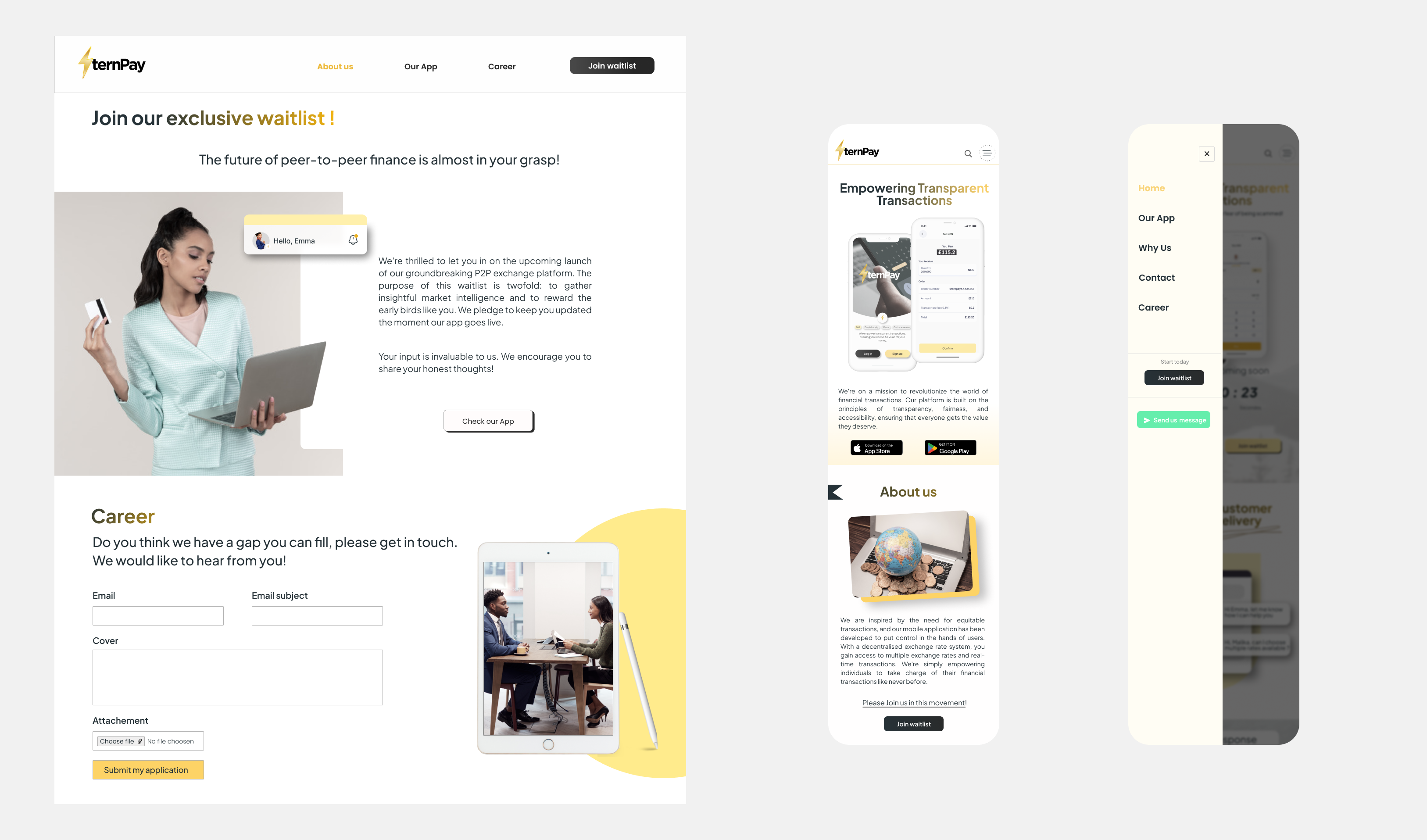
Responsive Design
This minimalist and elegant landing page is designed to optimize clicks while showcasing the application in a clear and appealing way. The purpose is to attract real prospective users, allow them to interact with the app, and gather valuable feedback through targeted testing campaigns. The goal: to validate interest, identify friction points, and refine the experience based on real user insights.
Expected Outcomes
- Attract a maximum number of interested users to test the application, without bias, since they are real users actively searching for this type of solution.
- The landing page allows them to view and try the app, and to provide relevant, actionable feedback.